
Business Hub KSA
A brand worth walking into.
what we delivered.
- Brand & communication direction
- Social media content system
- Posters, wall quotes & space branding
- Print + digital consistency
the problem
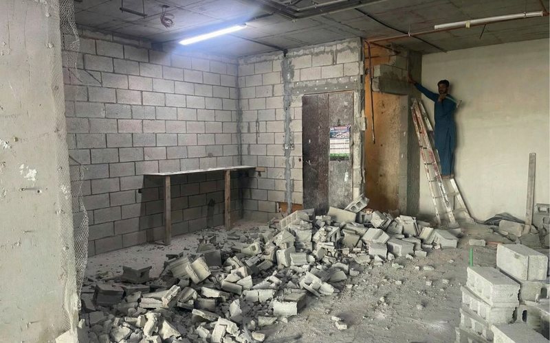
Business Hub KSA isn't just a workspace — it's an ecosystem, and it needed to feel like one. A raw space and an early brand had to become something worth walking into.
Workspace in Saudi Arabia stopped competing on desks some time ago. With Vision 2030 pulling regional headquarters into the Kingdom and a generation of founders choosing where to be seen, the decision is made on atmosphere, signal and community long before anyone compares a price list. A raw shell and a placeholder logo cannot carry that conversation.
strategy
One premium, modern brand carried consistently across the physical space, print and social — so every touchpoint reads as the same place.
The insight was that a workspace brand is experienced in physical space first and digitally second — the opposite of most brands we build. Someone walks past the door, sits in the lobby, photographs a wall. So the system had to be designed for walls, windows and rooms with the same seriousness usually reserved for screens, and had to survive being applied by whoever is on site that week.
execution
We set the brand and communication direction, built a social content system, and designed posters, wall quotes and space branding with visual consistency across print and digital.
Communication direction came first so the space and the feed would say the same thing in the same voice. Posters and wall quotes were written as brand copy rather than decoration, sized and placed for how people actually move through the building. The social content system was built so the space itself becomes the content engine — every corner shot, every event, every member moment feeding a feed that looks like the room it came from.
creative process
We designed for the photograph. In a workspace, the most valuable marketing asset is a member taking a picture of where they are sitting, so we treated wall typography, signage and corner details as compositions that would hold up on a phone screen. Print and digital were built from one system rather than translated between two — the same type, the same spacing logic, the same restraint — so a poster in the lobby and a post in the feed read as the same place.
result
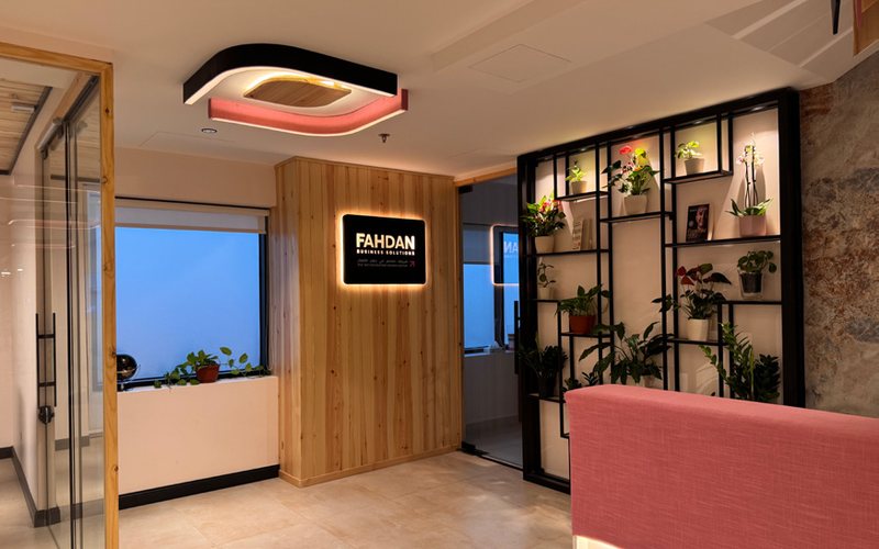
A brand that feels premium, modern, and "worth walking into" — from the front desk to the feed.
lessons
For a physical business, the brand is a place before it is a logo. Design the walls and the doorway with the care you would give a homepage, because that is the version of the brand people photograph, share and remember.
"A brand worth walking into."